Scroll down to see explanations for upper-air maps on the:
• 25 kPa,
• 50 kPa,
• 85 kPa
isobaric surfaces.
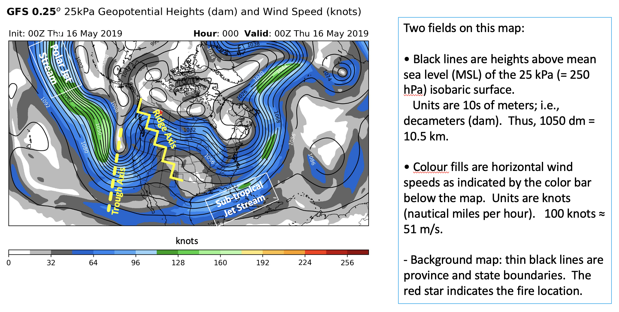
Pressure 25 kPa (250 hPa) is near the tropopause, and thus is at a height near the core of the jet stream. At this height, winds generally blow parallel to the height contours (i.e., the black lines), generally from west to east. More closely-spaced black lines on this map imply a stronger pressure gradient that drives stronger winds.The colours show how fast the winds are, to help you identify where the jet streams (polar jet, subtropical jet, and sometimes a merger of those two jets). Regions of fast winds within the jet stream are called jet streaks (shown by the green colour fills in the map above).
The north-south (i.e., meridonal) meanders of the jet stream are called Rossby waves. Where the jet stream meanders equatorward is a trough, associated with upper-atmospherie low-pressure, and cyclonic vorticity (winds that turn counter-clockwise). We annotated this weather map to indicate the axis of the trough with a dashed line (yellow on the example above).
Where the jet stream meanders polward is a ridge, associated with upper-atmosphere high pressure and anti-cyclonic vorticity (winds that turn clockwise). We annotated this weather map with a zig-zag line (yellow in the example above) to indicate the ridge axis. Normally, the weather maps you use in this course will not have the ridge and trough axes annotated.
We have added a red star to indicate where the fire is located. On the example above, it is in northern Alberta, almost hidden by the "R" in the "Ridge Axis" annotation.
Rossby waves are a driving mechanism that creates the weather that affects wildfires, which is why it is often the first weather map that is presented during a weather briefing.
These troughs and ridges drive upward and downward (subsidence) vertical motion, respectively. The combination of these vertical motions and vorticitiy can cause surface pressure to decrease or increase, creating or strengthening surface Lows (extratropical cyclones) and surface Highs (anticyclones). The Lows and Highs are generally associated with bad weather (storms) and fair weather, respectively. Often cyclogenesis (creation or strengthing of a surface Low) forms in the region between the trough and ridge, east of the trough and west of the ridge.
Polar jet streams often form at the dividing line between cold air on the polward side and warm air on the equatorward side of the jet stream. This is due to the thermal wind effect, which is described in the weather-theory part of this course. Nonetheless, by looking at the jet stream location on a weather map, we can quickly estimate which locations are in relatively cold air (north of the jet stream) , and which are in relatively warmer air (south of the jet stream).
Although the figure above is just a single frame, the actual maps that you use consist of a sequence of frames at different times, so you can step forward or backward in time by using the arrow keys on your keyboard. This feature allows you to see how fast the trough axes and ridge axes are moving, which direction the axes are moving (eastward, westward, or not moving), and whether the troughs and ridges strengthening (namely, as the extent of the north-south meanders increase). When Rossby waves are not moving toward the east or west, this situation is called a "blocking pattern", which can result in long periods of relatively unchanging weather.
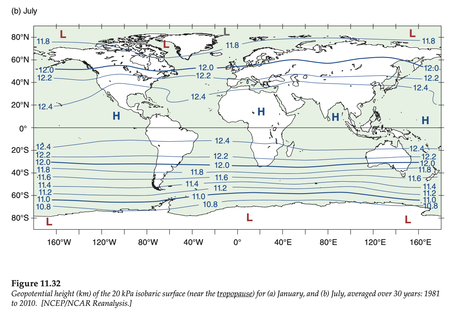
For any month, we could average the weather over 30 years to get the climatological average weather for that month. Although I didn't happen to have one available for the 50 kPa isobaric surface, here is a similar map showing the average heights on the 20 kPa isobaric surface, for July.
An "anomaly" is a deviation from the climatological average. Anomalies happen all the time, because the weather on any given day is rarely equal to the long-term average. An advantage of plotting anomalies is that it highlights those deviations. For the 50 kPa map below, the anomalies help us find highs and ridges, and lows and troughs.
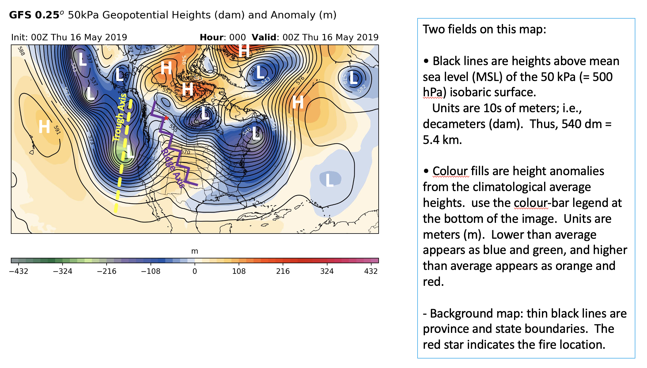
Winds generally blow parallel to the black lines, from west to east. Black lines that are packed more closely together indicate faster winds. At this height in the middle of the troposphere, winds are generally not as fast as they are in the core of the jet stream, near the top of the troposphere.
The north-south meanders show ridges and troughs in the Rossby waves. We added annotations for trough axes and ridge axes, similar to the annotations on the 25 kPa map. The colour shading for the anomalies makes it easier to find the highs and lows.
However, at this mid-tropospheric level, we also see closed Lows (I added annotations of white "L"letters to indicate low centers). And we see closed Highs (I added annotations of which "H" letters to indicate high centers).
50 kPa maps help us understand large-scale weather patterns and identify highs/ridges and lows/troughs. These maps are also helpful due to the relationship between 50 kPa height patterns and the air temperature under this height level. Lower 50 kPa heights and negative anomalies generally are associated with cooler air temperatures at the surface. While higher 50 kPa heights and positive anomalies typically are associated with warm air temperatures near the surface. These maps help us conceptualize what is occurring at many levels in the troposphere.
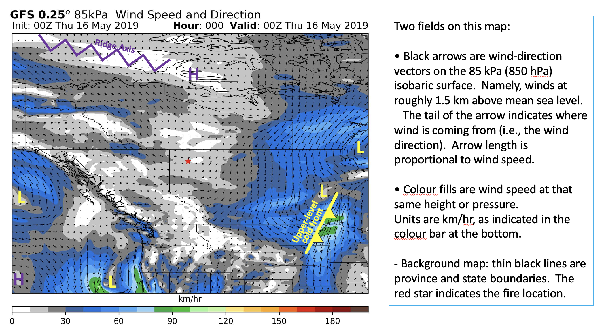
These winds are at an altitude that often are near the top of the Atmospheric Boundary Layer (ABL). They are partly influenced by the underlying terrain, partly influenced by turbulence in the ABL, and nonetheless often show synoptic features such as upper level fronts (see an example annotated in yellow), lows (annotated with yellow L), highs (annotated with purple H), troughs and ridges (annotated with the purple zig-zag line).
Often, but not always, Northern Hemisphere winds over Canada from the north are generally colder and drier, while winds from the south are generally warmer and more humid. However, near coastlines of oceans and large unfrozen lakes, the water body can modify the air (this is called air-mass modification). Thus, by considering both large-scale and local effect, we can make a guess about advection of warm or cold or moist or dry air toward wildfire sites.
Winds are generally slow near Highs and ridges, and are usually faster near lows and fronts. There are often sharp changes in wind direction and speed across fronts. The front annotated in the figure was located by the wind shift line. Its identification as a cold front was guessed, based on winds from the northwest (likely cold air from up north) are approaching the frontal boundary, while warmer air from the south is sliding parallel to the front.
Strong winds that are hot and dry can allow fires to intensify and to rapidly spread. Also, if colder air aloft is advecting over warmer air near the surface, then it is likely that the atmosphere will become more unstable and convective, perhaps allowing thunderstorms to form (which can cause lightning that starts other wildfires).
As this pressure level is often within or near the top of the atmospheric boundary layer, the winds and stability at this level are useful for anticipating wildfire smoke transport and dispersion.