Scroll down to see annotated weather charts for:
• Vertical Cross-sections of wind speed and: T , θ , Z anomalies , mean Z
• Upper-level Divergence
.
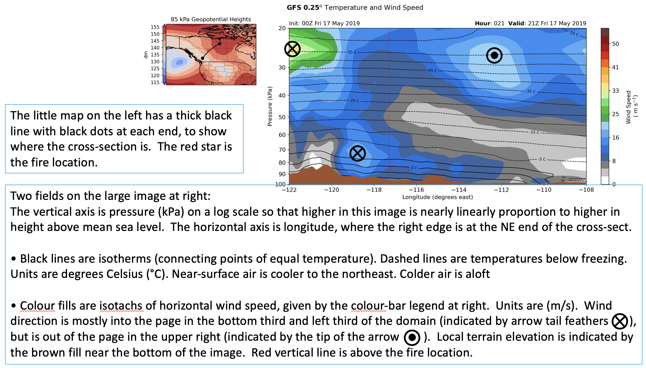
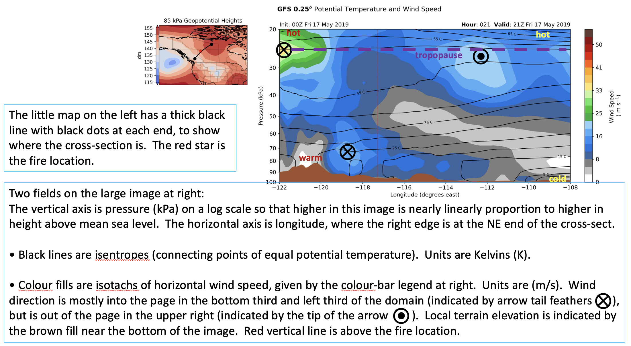
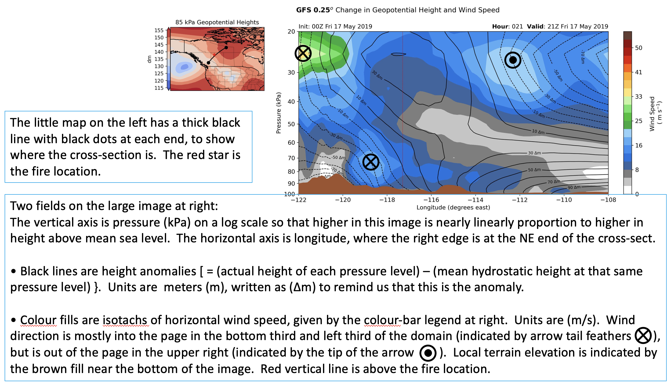
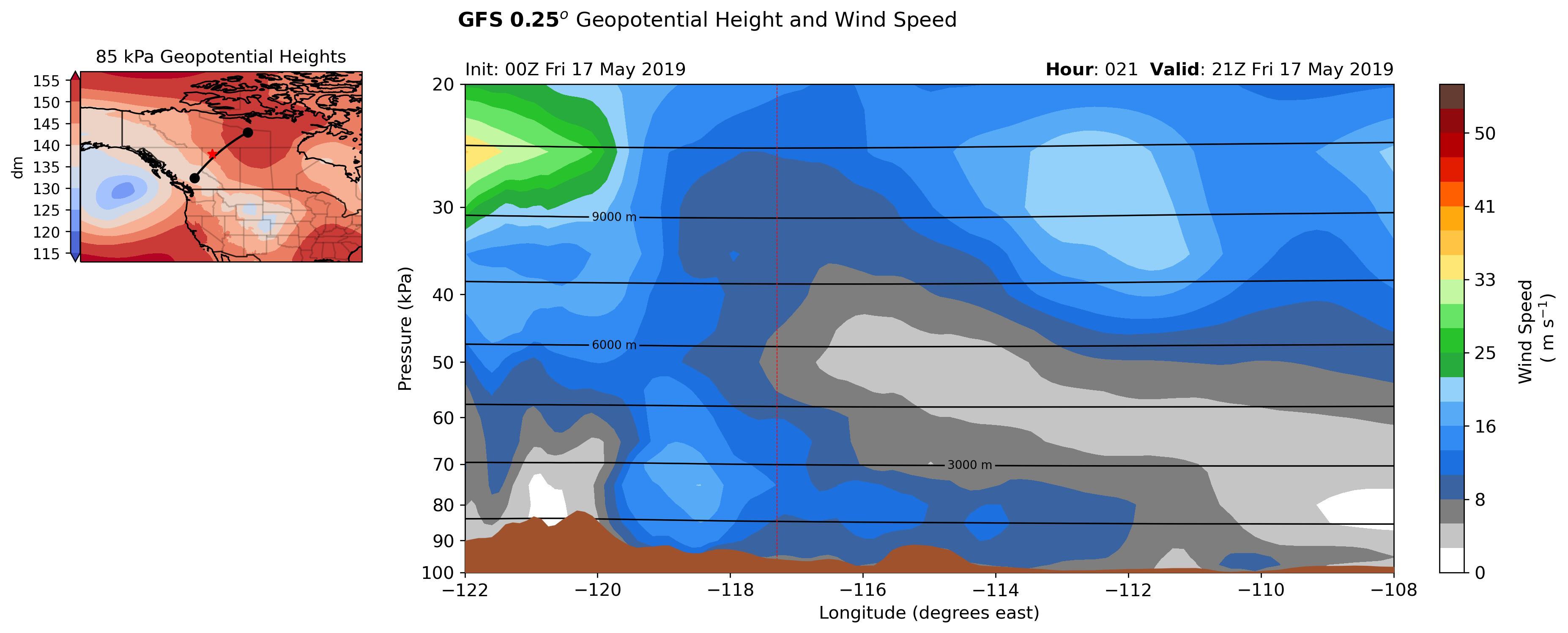
All the figures have the same backgroud map of horizontal wind speed. The two circular regions of lighter blue indicate relative faster winds, while the green/yellow region is very fast winds. The bottom lighter blue circle indicates a low-level jet into the page (blowing from southeast toward northwest). The light-blue circle centered near29 kPa is the polar jet, blowing out of the page. The green/yellow region near the top left is a faster jet stream core blowing into the page.
Figure (a) shows that the actual air temperature decreases with increasing height.
More useful is figure (b), which shows that the potential temperature increases with height. Regions where the isentropes (lines of equal potential temperature) are closely spaced near the top of the figure indicate the strong static stability in the stratosphere. The base of the stratosphere is the tropopause, as annotated on this map. Just above the ground, there is a horizontal gradient of potential temperature from warmer theta (potential temperature) values at the left side of the graph to colder theta values at the right.
A plot of geopotential heights was not very revealing (and is not shown here), because it is dominated by the hydrostatic decrease of pressure with height. However, we can calculate the horizontal mean pressures of key height surfaces (plotted in Fig. d).These mean height contours are horizontal, implying no horizontal pressure gradient in the mean. We can subtract the mean heights from the actual geopotential heights to give a graph of the height anomalies (Fig. c). These are much more revealing, and show interesting horizontal pressure gradients that can drive horizontal winds.
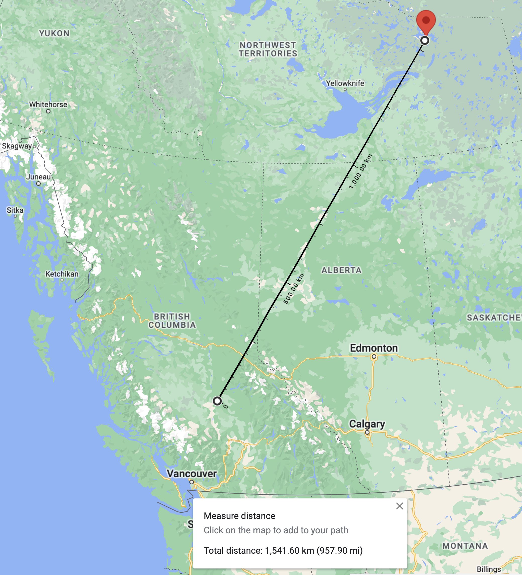
This next map shows more detail where the vertical cross-section is located.
The cross section goes between (latitude , longitude) end points of
64.0°N, -108.0°W
52.0°N, -122.0°W
as shown on the map below. That corresponds to a great-circle distance of about 1560 km between the two end points. Namely, each degree of longitude on the bottom axis of the cross section corresponds to an actual diagonal distance of about 111 km along the cross-section line.
Thus, with this way to use the bottom axis as a horizontal distance scale, and with the height contours in figure (c), you can estimate horizontal pressure gradients, which we know can drive horizontal winds.
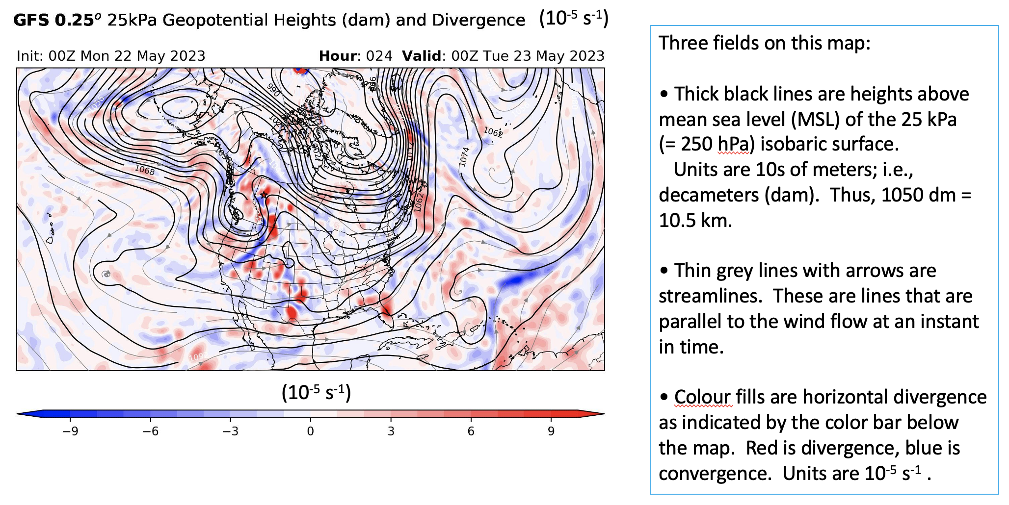
The height contours on this map are the same as those on the normal 25 kPa height-contour map. In the northern hemisphere, generally low heights are toward the pole and high heights are toward the equator. This meridonal pressure (or height) gradient drives the jet-stream winds from the west.
The streamlines show that the wind generally flows from west to east, but doesn't perfectly follow the height contours. If winds were to blow at steady speeds, then we would expect the streamlines to perfectly follow the height contours. However, in real life, as the air accelerates and decelerates to try to get into geostrophic balance around curved height contours or in regions where the contour packing (spacing between height contours) changes, the temporary force imbalance causes the air to cross the height contours at a small angle.
Of most interest on this chart is the divergence/convergence. Regions of horizontal divergence (red colors on the map) in the air flow at the 25 kPa isobaric level tend to support cyclogenesis near the surface directly under the divergence regions. This is due to air mass being removed from that part of the atmosphere, as discussed in the Meteorological Concepts part of the course web page.
Look for the (red) divergence regions on this upper-air map, as those are locations where new Lows (and associated fronts and bad weather) might form, or existing Lows might strengthen on a surface weather map.
xxx
xxx
xxx
(Under Construction)