|
Geophysical Signals and Data Processing |
|
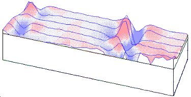
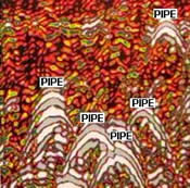
A slightly less advanced version of this page about signals is here. IntroductionGeophysical "signals" exist in a variety of forms. The signals can depend upon time or location, or both. For instance at any location on Earth, the magnetic field changes with time and we want to record this temporal variation. Alternatively, a buried drum or pipe may have a magnetic field which varies with location. Sometimes we have signals that depend upon both time and space. Seismic and ground penetrating radar signals fall into this category.
Signals in time or space are continuous. Consider the magnetic field, barometric pressure, ground motion, or wind speed at any location. Each of these quantities varies continually with time. Most instruments are electromechanical devices that produce a continuous waveform as a function of time. If this waveform were recorded directly then we would have an analogue signal. (e.g. a barometric pressure chart, ground motion measured with a pen on a rotating drum). Prior to the age of digital recorders analogue records were the only form of data collection. Today most signals are digitally sampled so they can be stored on computers, processed and plotted. Before looking at sampling we consider the simplest and most fundamental of all signals, sinusoids. SinusoidsSinusoids can be written as:
These are the harmonic continous waveforms. (Note the symbols assume you have a "symbols" font on your computer - likely for Windows machines, unlikely for Unix machines).
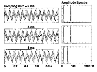
Any signal may be made up of a linear combination of sinusoids with each sinusoid having its own frequency, amplitude and phase. This is the heart of Fourier analysis which we shall talk briefly about later. Digital data, Sampling Interval, Nyquist Frequency, AliasingAnalogue data are difficult to work with. Much greater flexibility in processing data is obtained by working with digital data. Effectively, a signal is "sampled" at uniform intervals (
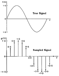
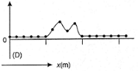
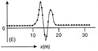
This is effectively illustrated in a second example below; click the figure for a larger version with an explanation. The top curve is an analogue signal and the dots represent the sampling points. The sampled time series is shown in the middle, and the reconstructed signal, obtained by joining the dots in (b) is given at the bottom. Notice how much information is lost.
How often do you need to sample a signal so that all information is retained?In order to retain all of the information that is in the initial signal, it is necessary to sample so that you have at least two samples per cycle for the highest frequency that is present in your data. If you sample a sinusoid with frequency of 50 Hz then your sampling interval must be less than or equal to 0.01 seconds - in other words, a 50 Hz sinusoid must be sampled at least 100 times per second. If you sample a complicated signal made up of many frequencies, say from 50 hz out to 300 hz (like a typical seismic signal), you must sample this signal with at least 600 samples per second in order to recover the signal accurately. If you have a fixed sampling interval (for example, you only took measurements every 5 meters along a line), what is the highest signal frequency you could recover from the data? The question is so important that there is a name for the highest frequency sinusoid that can be recovered: it is called the Nyquist frequency and its formula is
where
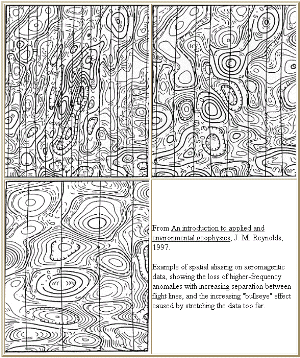
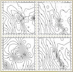
Aliasing can have disastrous consequences when interpreting geophysical data, and it should be guarded against whenever possible. Proper observation begins by knowing the highest frequency (or wavenumber for spatial signals) in the signal and choosing a sampling interval accordingly. This is generally possible in time-recordings, but it is more difficult in the spatial domain because earth structure near the surface can give rise to high frequency (or more correctly, high wavenumber) signals.
The effects can be serious for maps as well. Click the images for full-page versions of these two figures from Reynolds, 1997.
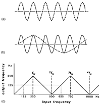
What in fact will the recorded data look like if it has been aliased? Suppose you are sampling data which has a frequency ftrue that is greater than the Nyquist frequency. The digital series will look as if it has a sinusoidal at frequency frec where
where n = 0, 1, 2, ... and is large enough so that
The negative frequencies are needed in the description. Perhaps the easiest way to get an intuitive feel for the need for negative frequencies is to remember the old western movies with wagon wells. The camera is sampling the image at a fixed rate. Depending upon the actual speed of the wagon the wagon wheel can appear to be moving clockwise (positive frequency), stopped (zero frequency), moving counter-clockwise (negative frequency). Anyone who is familiar with watching scenes in the presence of strobe-lighting will be familiar with these effects. Signals depicted in time or frequencyHere is one more example of aliasing. Click figure for a larger version. This figure introduces a new kind of graph - the spectrum. Normal plots of data show signal strength versus time or position. (Contour maps do this for x-y positions.) A spectrum plots the signal strength versus frequency. The x-axis has units of Hertz (cycles per second). The spectrum of a signal that is a combination of two sinusoids will look like two spikes (as shown below).
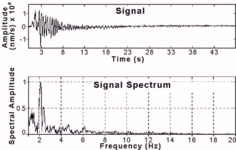
To complete the illustration of time versus frequency plots (a normal signal versus it's spectrum), here is a seismic signal (ground motion caused by an earthquake). The time series is a complicated looking signal. In fact, this signal can be described as a combination of a very large number of sinusoids, all with amplitudes as shown in the spectrum graph.
Digital FilteringThere are many reasons for wanting to filter your data.
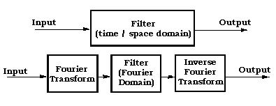
Some types of filtering are most easily carried out by working with the original recorded time series. In other cases the filtering is most easily accomplished by first converting the recorded time (or space - as in a map) data into the frequency domain, working with this so-called "Fourier transformed data", then converting the result back into the time (or space) domains to see and use the filtered data. These two options for filtering are illustrated in the following diagram. Fourier transforms and the related mathematics are interesting enough to be the subject of whole courses in engineering, financial analysis, as well as geophysics and other disciplines.
Noise and StackingGeophysical data are the sum of two elements:
OBSERVATION = SIGNAL + NOISE There are many different kinds of "noise" and in fact there is no unique definition because noise depends upon the goals of the problem. The saying "one man's signal is another man's noise" is often valid for geophysical data. (e.g. seismic reflection/refraction data; ocean bottom magnetometer data; magnetic vs magnetotelluric data). Noise in geophysical data may be:
It is possible to reduce noise without loss of signal if you collect the noisy data several times. Here's how it works. Suppose you added up a whole set of independent versions of the experiment. Each version has noise, but if the noise is random, the noise is different in each version of the data. Let us name the noise on the "ith" version of experiment Xi. This noise has a standard deviation of
where N is the actual number of times the experiment was done (in other words, the number ot trials). The mean (average) value of Y is zero because the mean value of each random variable Xi is zero. However the standard deviation of this sum is
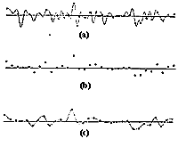
This says that the standard deviation of our sum is smaller than standard deviation of any one trial by a factor of 1 over square root of the number of trials. This has important implications. If you sum geophysical observations which are composed of the same signal but different realizations of the noise then the signal to noise ratio is improved by a factor of sqrt(N). For this reason it is often customary to record data that come from repetitions of the same experiment, and to then average the results. This is sometimes referred to as "stacking". (NOTE - to be strictly correct, the arguments above assume that the random noise is in fact "Gaussien" - which is a particular type of randomness. This is not an unreasonable assumption for many types of noise on geophysical data.) Example of stacking. The top figure in the image below is the original signal. Click the buttons to see versions of the signal before and after stacking, as indicated by each button's label.
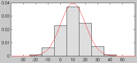
Gaussian NoiseGaussian noise is characterized by a probability that any realization of the noise takes on a certain value. The probability density function looks like:
The quantity
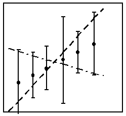
Finally, in general we don't know very much about the noise which is contaminating the data. We need to ascribe some uncertainty to the measurement so we often make the simplest assumption. We say that the noise is Gaussian and has a given standard deviation and is unbiased. Furthermore we often assume that the noise is uncorrelated between adjacent samples. All of these assumptions are likely violated to some degree but this still gives us a good place to start. In advanced interpretation we are interested in finding a distribution of physical properties that reproduces or "fits" the data. The concept of adequately fitting the data requires a knowledge of what the errors are on the data. Consider the following illustration.
The point here is, if we can not tell how noisy the data are, we can NOT estimate reliably what kind of model could cause the data. Even if assigning some measure for error bars is done based upon experience rather than by actually measuring the noise level, it is still important. And, when the error bars are assigned, it is usual to assume errors have Gaussien behaviour.
|
||||||||||||||||||||||||||||||||||